Template

Burndown chart: track the progress of sprint tasks in Scrum project management

PRO

Burndown Chart

Level
In-person
Remote
Shared by 

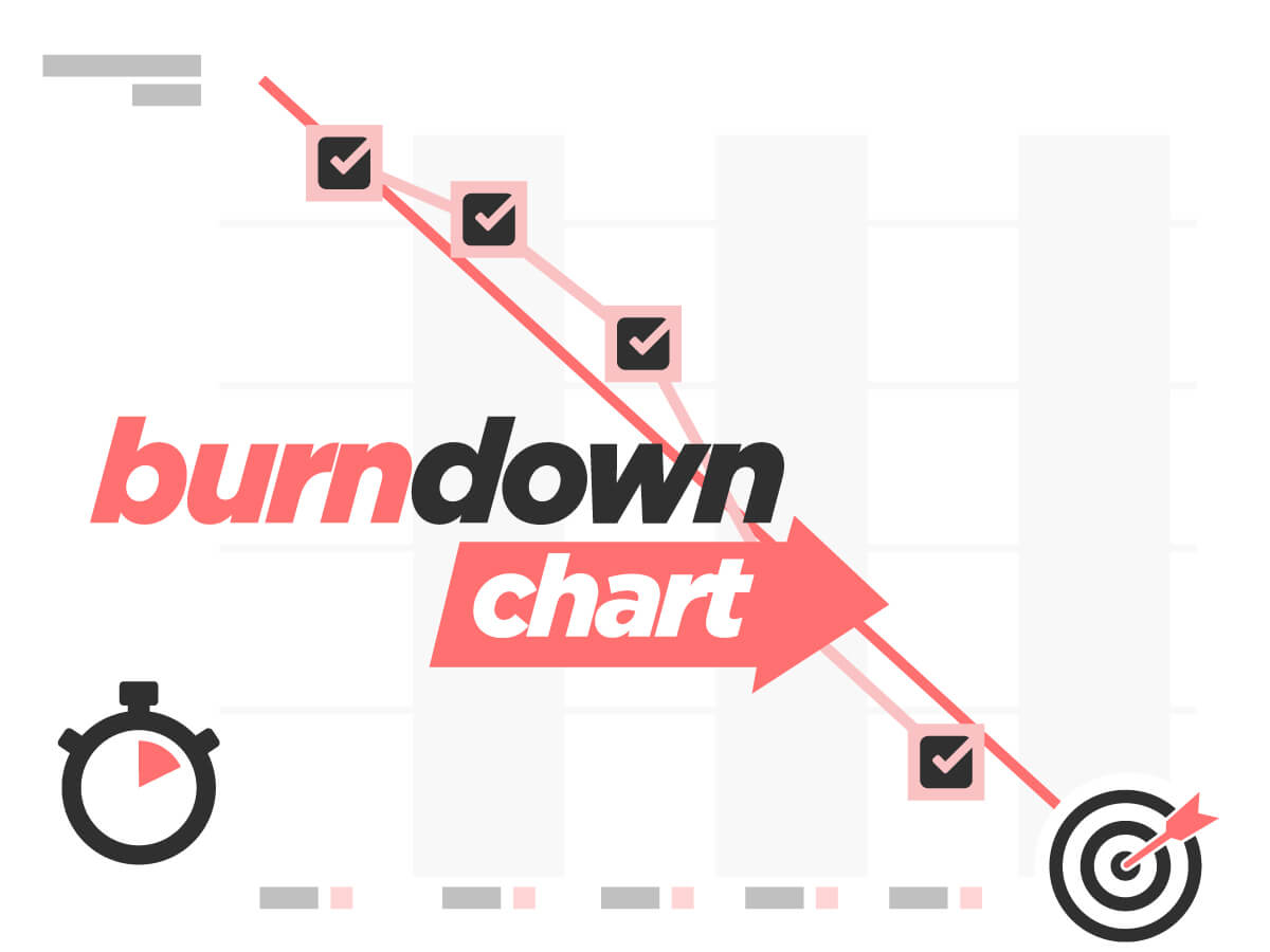
Working as a team, use the Burndown Chart template to update the list of pending sprint tasks in chart form.

Every day, as a team, display the number of tasks still pending for the current sprint.

Update the Burndown Chart each morning throughout the product's development cycle (a.k.a sprint), so the Scrum team can keep track of the work in progress. The Chart also helps to make sure that the entire team is working in the same direction.
Use the Template to keep track of the team's workload over a given period of time in chart form and to get a daily visual update of the list of tasks still pending, against initial forecasts. This gives you a clear daily overview of the work in progress! Post Questions to the project manager at any point in time and reassess the objectives in agile management mode!

Burndown Chart essentials for your Scrum project management processes

The Scrum model is an agile methodology for the development of products or features that operates in development cycles known as sprints. Ken Schwaber and Jeff Sutherland’s Scrum Guide is the ultimate benchmark for scrum project management. The method is broken down into several stages, known as events or ceremonies, such as sprint planning at the start of the cycle, or the sprint retrospective at the end of the cycle. A number of tools are used throughout the sprint, such as the Product Backlog and User Story Mapping. In this case, we will be focusing on the Burndown Chart.

What is a Burndown Chart?

It is a very simple chart that scrum project development teams can use to keep tabs on the work in progress and identify any blocking points in their project management.
Used throughout the sprint, i.e. the product’s development cycle, the Burndown Chart helps teams make sure they are working together in the same direction. It is a very useful tool to check that a team is on course toward its target objective. Each sprint has its own Burndown Chart, and it is likely to change as the project progresses.

How does a Burndown chart work?

As the name suggests, a Burndown Chart is a two-dimensional display: the total number of tasks to be completed during the sprint features on the y-axis (the vertical axis), and the sprint’s duration in days is on the x-axis (the horizontal axis). A diagonal line is plotted as a reference, and the chart curve is updated daily: completed tasks are removed, and only pending tasks appear. The chart therefore provides an indication of tasks pending according to the time available, namely remaining sprint days.

Who uses the Burndown Chart?

This tool can be used by all development team members, including the Product Owner – equivalent to the product manager in Scrum methodology – and the Scrum Master, an agile coach. Everyone can view task progress and adapt them if necessary to optimize the project management process. Stakeholders (internal or external clients) may also view the Burndown chart, if required, to check on the team’s progress and make sure the project is running according to plan.

What Scrum project management phase does the Burndown Chart cover?

Ideally, the Burndown Chart should be updated throughout the project management cycle, at the beginning of the daily scrum. According to Scrum methodology, the daily scrum is the event that kick-starts the team’s day during a sprint. This daily meeting encourages communication within the development team and helps to promptly identify any issues. Team members are briefed on their daily objectives as well as on any hurdles they may come across. Participants briefly answer three questions: What did I do yesterday? What am I going to do today? Are there any issues I need to address?
The daily scrum is the ideal time to update the burndown chart. On a daily basis, the Scrum team compares task completion with the initial objective: if the curve descends and follows the predictive line it means that the team is working at the right pace.

What is the actual purpose of the chart?

On the one hand, as explained above, the Burndown Chart is a tracking tool, and on the other hand it also helps identify malfunctions when there is a break in the curve or if it is too far off the predictive line. Here is a typical example of what the Burndown chart can reveal: toward the end of the sprint scrum (development cycle), the team has completed twenty-five tasks out of a target total of sixty. The development team still has a long way to go before it can deliver the promised product increment. There can be a number of causes, such as:

  • the team has built up technical debt, meaning that there have been a number of IT bugs, obsolete or non-standard coding, etc. Technical debt leads to significant time loss trying to correct errors rather than going ahead with other tasks.
  • poor project preparation, i.e. the sprint planning phase was rushed and the functional criteria in the user stories were overlooked. To avoid such pitfalls, the Sprint Planning tool is ideal to ensure suitable scrum development cycle preparation.
  • lack of communication between the team and the Product Owner, who may not be available for validations and the situation has led to a bottleneck.
  • the scrum team set the objective too high with respect to their resources and abilities.
  • there can also be purely human-related factors: team members leaving the company, on sick leave, etc. This is a workforce-related situation that is beyond the team’s control.

These malfunction examples can be highlighted by the Burndown Chart. The sprint retrospective event will help the Scrum team address these issues and look for areas for continuous improvement for the next development cycle.

What is the difference between a Burndown Chart and a Scrum Task Board?

The Burndown Chart is often associated with the Scrum Task Board, although they are separate tools. The Burndown Chart provides a detailed overview of the sprint’s progress during the daily scrum. It should not be confused with the scrum task board, which is a board divided into three sections: pending, ongoing and completed tasks. As opposed to the Burndown chart, which acts as a malfunction indicator and detector, the scrum task board is a reporting tool.

Scrum project management: 3 key reasons why you should use Klaxoon’s Burndown chart

  • 1. Klaxoon’s solution can be particularly useful for development team members working in different locations. Team members can easily view the project’s progress wherever they are. With Board, all the information is centralized and readily available for teams working remotely for example. Board’s features facilitate interaction: with Live, the built-in video conferencing tool, team members can see one another and communicate efficiently, with the “Synchro Board” feature giving all participants simultaneous access to the same content, without missing out on any information.
  • 2. The digital whiteboard is an unlimited workspace. This means you can use several tools simultaneously during your sprint and pool any useful information. Everyone can contribute, wherever they happen to be, with ideas, editing other participants’ ideas, changing a color or graphic item, etc.
  • 3. The Burndown Chart is available to all at any time, not only for the daily update meetings. Regardless of their role, users can view task progress whenever they need to.

How is the Burndown Chart template used?

  • Development team members log in to the Board daily and run a Live session, the built-in video conferencing tool.
  • They move their picture to the current day and update their pending task list in the box below the relevant idea. Boxes are optional fields where additional information on the idea can be entered. They are adjustable in the Board’s options. Any type of information can be entered in the boxes: names, deadlines, quantities, etc.
  • Simply add up the team’s pending tasks and add this number to the chart.
  • Then use the quick connectors to connect the day’s idea with the previous day’s idea and continue plotting the line throughout the sprint.
  • The team’s number of pending tasks is visually updated on a daily basis in relation to initial forecasts. Each day, you know exactly where you stand!
  • Use Questions to alert the Product Owner and readjust the objectives in an agile manner. The number of tasks initially determined to reach the end target is changeable: it can even be upscaled during the cycle if the workload was underestimated. Updating the task number means the chart will always give a true picture.
  • If your curve is too far off the predictive curve, warn the Product Owner immediately and see how lower priority tasks (or “user stories”) can be removed.

Use this template to keep tabs on the remaining workload over a given period of time in chart form.

Unlock your teamwork potential

For free, make your first steps to top-tier work efficiency with the Klaxoon Visual Platform.
Start for free